Why Graphic Consistency and Colour Drive Exhibition Panel Design
Make your exhibition stand unforgettable with precise exhibition printing & panel design. Use colour psychology and cohesive design to attract visitors
First impressions matter, especially in the fast-paced world of exhibitions. In a crowded venue filled with competing brands, a visually compelling stand can mean the difference between a visitor stopping or walking past. This is where colour psychology and graphic consistency come into play.
A well-designed exhibition stand isn't just about looking good, it's about reinforcing brand identity and guiding visitor perception. The right use of exhibition printing and exhibition panels ensures that your booth isn't just another stall in the crowd but a memorable experience. Let's explore how these elements shape effective design.
The Psychology of Colour in Exhibition Panel Design
Colour isn’t just an aesthetic choice; it’s a psychological tool that can influence emotions, reactions, and decision-making. Understanding how colours work in it is crucial for designing a visually impactful stand.
How Colours Influence Engagement
Different colours evoke different emotions. For example:
|
Colour |
Emotional Response |
Best Used For |
|
Red |
Excitement, urgency |
Sales, clearance signage |
|
Blue |
Trust, professionalism |
Corporate branding |
|
Green |
Sustainability, calmness |
Eco-friendly brands |
|
Yellow |
Optimism, attention |
Call-to-action areas |
|
Black |
Luxury, sophistication |
High-end brands |
A technology firm may opt for cool blues to establish trust, while a sustainable business may choose greens to reinforce its eco-friendly values.
Common Colour Mistakes
- Overuse of Bright Colours – Too many strong hues can overwhelm the eye, making the design chaotic.
- Poor Contrast – Text blending into the background reduces readability. Always ensure high contrast between fonts and backgrounds.
- Ignoring Brand Identity – Your exhibition panels should align with your brand’s existing colour scheme to maintain consistency.
Exhibition Printing: Precision in Colour Reproduction
A beautiful design comes to life when exhibition printing accurately reproduces colours with precision. High-quality printing enhances visual appeal, ensuring brand consistency across all exhibition panels and promotional materials. With the right printing techniques, every shade remains vibrant and professional, creating a strong and memorable brand presence..
Challenges in Colour Mismatch
One of the biggest problems in exhibition printing is colour inconsistency. What looks perfect on a digital screen may appear entirely different in print. Reasons include:
- Differences in RGB (digital) vs. CMYK (print) colour modes.
- Variability in printing materials affecting how colours appear.
- Lighting conditions at the exhibition impact perceived colour accuracy.
Choosing the Right Printing Technique
|
Printing Technique |
Best For |
Benefits |
|
Digital Printing |
Short runs, vibrant colours |
Cost-effective for smaller quantities |
|
UV Printing |
High-quality, durable prints |
Scratch-resistant and long-lasting |
|
Offset Printing |
Large-scale production |
Consistent colour quality |
For brand consistency, always request a test print before mass production.
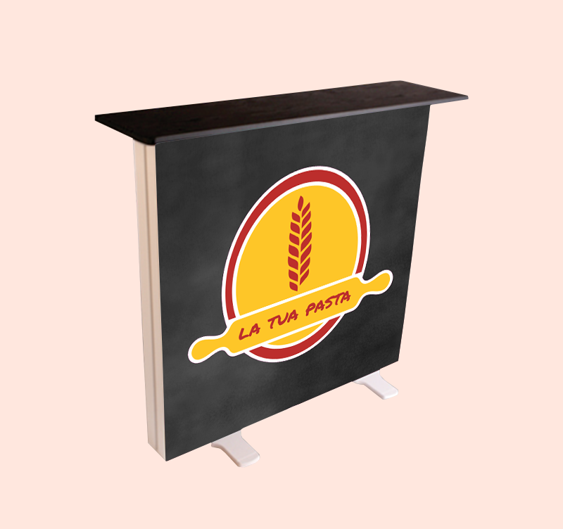
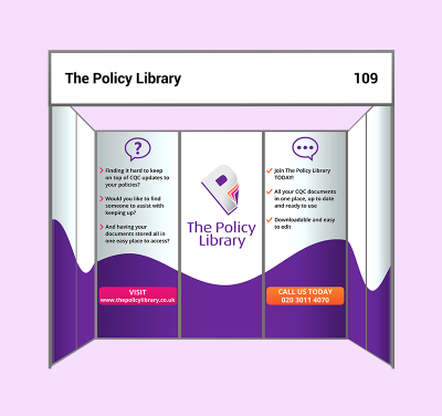
Graphic Consistency: The Key to a Cohesive Exhibition Stand
Visitors should instantly recognise your brand, whether they’re looking at a single panel or your entire stand. Graphic consistency ensures that all visual elements work together harmoniously.
How to Maintain Consistency Across Exhibition Panels
- Uniform Font Usage – Stick to a maximum of two fonts. A mix of styles can look messy.
- Consistent Logo Placement – Keep logos positioned similarly on all panels for a cohesive look.
- Alignment & Spacing – Poorly aligned elements disrupt the flow of information. Ensure proper spacing between text and images.
Example of Inconsistent Branding
Imagine a company using different logo sizes across its exhibition panels. Some panels have stretched versions, others cropped. Visitors may feel confused or perceive the brand as unprofessional. Consistency avoids such blunders.
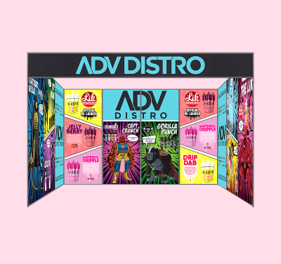
Exhibition Panels: Designing for Impact and Brand Recall
It needs to do more than just display information they should captivate, inform, and guide visitors through your brand’s story.
Strategic Panel Layout for Maximum Impact
|
Panel Position |
Purpose |
Effectiveness |
|
Front Panels |
Brand message & visuals |
Captures initial attention |
|
Side Panels |
Product details |
Engages visitors who stop by |
|
Back Panels |
Company story & contact info |
Reinforces branding |
Using Modular Panels for Flexibility
Modular panels allow you to rearrange and repurpose sections for different exhibitions. This is a cost-effective solution that keeps your branding fresh while maintaining consistency.
Exhibition Panel Blunders That Weaken Your Impact
A well-intentioned design can still go wrong. Clashing colours, inconsistent branding, and poor lighting can all weaken the impact of your exhibition panels. Overcrowded layouts can overwhelm visitors, making it harder for them to absorb key messages. High-quality exhibition printing ensures sharp, professional visuals that maintain brand credibility and leave a lasting impression.
- Clashing Colour Schemes – An explosion of colours can make your stand look chaotic rather than inviting. Stick to 2-3 primary colours.
- Mismatched Branding Across Materials – Your banners, flyers, and exhibition panels should follow the same colour codes and typography.
- Neglecting Lighting Considerations – Poor lighting can distort printed colours, making them appear dull or off-tone. Always test panel colours under different lighting conditions before finalising printing.
The Future of Exhibition Printing and Panels
With advancements in exhibition printing, brands have more options than ever to create stunning panels that are visually striking and long-lasting. Improved printing techniques ensure sharper colours and greater consistency, helping businesses maintain a strong brand presence. As exhibition designs continue to evolve, high-quality exhibition panels remain essential for creating a professional and memorable display.
Sustainable Printing Solutions
- Eco-friendly inks – Made from soy or water-based solutions, these reduce environmental impact.
- Recyclable Materials – Many modern exhibition panels are now created using biodegradable or reusable materials.
Emerging Trends in Colour Accuracy
- Advanced colour calibration ensures printed materials match digital designs.
- Special coatings enhance vibrancy and durability.
Sustainable and high-quality printing techniques are shaping the future of exhibitions, helping brands leave a lasting impression while reducing waste.
Conclusion
Graphic consistency and colour psychology play a vital role in shaping visitor perception at exhibitions. From the careful selection of colours to ensuring seamless branding across exhibition panels, these elements create a cohesive and professional stand that captures attention and builds trust.
Investing in high-quality exhibition printing ensures that your designs remain vibrant, accurate, and impactful under exhibition lighting. By considering layout, material, and emerging trends, brands can stay ahead in the competitive exhibition space. For businesses looking to create striking displays, partnering with experts VC Print ensures the best results bringing your vision to life with precision and professionalism.
What's Your Reaction?


.jpg)